


The Nagpur-based ice cream brand took this call after its director agreed the brand’s presentation and equity needed a refresh.
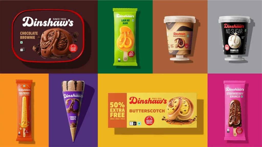
Dinshaw’s, the 93-year-old ice cream brand based out of Nagpur has undergone a complete brand makeover.
Starting mid-March, consumers and trade will see the brand’s new identity roll out across retail signages, parlour fronts, and digital platforms. This will be supported by new packaging for their entire ice cream portfolio, followed by a similar refresh in a few months, across their dairy, bakery and namkeen portfolios too.
Established in 1932, 50% of their business comes from the ice cream category, followed closely by dairy and milk products, with a fractional share coming from the bakery and namkeen categories. This legacy brand is based out of Nagpur and has a strong presence across Maharashtra, Madhya Pradesh, Chhattisgarh, West Bengal, Orissa, Andhra Pradesh, Telangana, Karnataka, Goa, Uttar Pradesh and Jharkhand.
Zervin Rana, Director at Dinshaw’s Dairy Foods, while extremely confident in the product quality and innovation at the back end, acknowledged that the presentation and equity of the brand needed some serious help.
Speaking about the brief for the new brand identity, Malvika Mehra, creative head, marketing, Dinshaw’s says, “It’s tricky revamping a logo that’s lived in people’s memory for 93 years. The original logo was the signature of the founder, Mr Dinshaw Rana himself. My brief to NH1 Design was simple, without losing the authenticity and legacy of the original, make our new logo relevant for 2025 and beyond.”
On crafting Dinshaw’s new brand identity, Neha Tulsian, founder and executive creative director, NH1 Design says, “The heartbeat of Dinshaw’s remains – the signature red, inspired by its legacy. But legacies must evolve. We unboxed the logo, allowing it to breathe freely across the packaging. At the heart of this transformation lies a powerful detail: a single drop of milk embedded within the ‘D’ – a quiet yet bold promise of purity, authenticity, and the wholesome abundance that defines Dinshaw’s.”
“The ‘D’ is no longer just a monogram; it has been elevated into a super-graphic that extends across the entire portfolio. After all, packaging is where brands truly live. By making the ‘D’ the focal point, we’ve created an intuitive brand signature – one that imprints Dinshaw’s promise of indulgence and quality into the consumer’s mind at a single glance.
This is more than a redesign – it’s a distinct and immediate visual language that evokes taste, memory, and desire. Because a heritage brand doesn’t just stay relevant. It stays iconic”.
Commenting about the packaging revamp, Zervin Rana says, “Our earlier ice cream portfolio was admittedly crowded with too many sub-brands within a complicated architecture, cut via many parameters – pricing, target audience, health, ingredients, formats etc.”
“Besides, the problem of limited display space in the freezer and limited budgets to push all sub-brands was an issue too. Hence, we first simplified the portfolio and brand architecture in ice creams before getting into a packaging design revamp”.
You can now read the most important #news on #eDairyNews #Whatsapp channels!!!
🇮🇳 eDairy News ÍNDIA: https://whatsapp.com/channel/0029VaPidCcGpLHImBQk6x1F